Advanced Usage
(Scoped) Slots
Slots are used to add content at a certain location in a widget. You can find out what slots a widget supports by using
the Vuetify documentation. If you want to know what slots Select has, search for v-select on the
Vuetify API explorer or for this example use the direct link. On the left-hand side of list of attributes you will find a tab
‘slots’.
An example for using the slot ‘no-data’, which changes what the Select widget shows when it has no items:
Vuetify:
<v-select>
  <template v-slot:no-data>
    <v-list-item>
      <v-list-item-title>
        My custom no data message
      </v-list-item-title>
    </v-list-item>
  </template>
</v-select>
ipyvuetify:
v.Select(v_slots=[{
    'name': 'no-data',
    'children': [
        v.ListItem(children=[
            v.ListItemTitle(children=['My custom no data message'])])]
}])
Scoped slots are used if the parent widget needs to share its scope with the content. In the example below the events of the parent widget are used in the slot content.
Vuetify:
<v-tooltip>
    <template v-slot:activator="tooltip">
        <v-btn v-on="tooltip.on" color="primary">
            button with tooltip
        </v-btn>
    </template>
    Insert tooltip text here
</v-tooltip>
ipyvuetify:
v.Container(children=[
    v.Tooltip(bottom=True, v_slots=[{
        'name': 'activator',
        'variable': 'tooltip',
        'children': v.Btn(v_on='tooltip.on', color='primary', children=[
            'button with tooltip'
        ]),
    }], children=['Insert tooltip text here'])
])
In the Vuetify examples you will actually see:
...
<template v-slot:activator="{ on }">
    <v-btn v-on="on">
...
Instead of the functionally equivalent (like used in the example above):
...
<template v-slot:activator="tooltip">
    <v-btn v-on="tooltip.on">
...
The { on } is JavaScript syntax for destructuring an object. It takes the ‘on’ attribute from an object and
exposes it as the ‘on’ variable.
Note
The ‘default’ slot can be ignored, this is where the content defined in the children attribute goes.
Responsive Layout
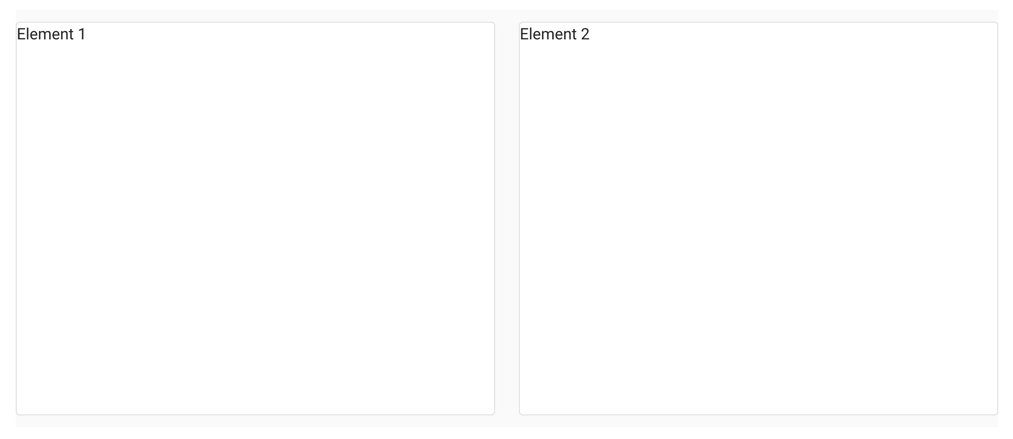
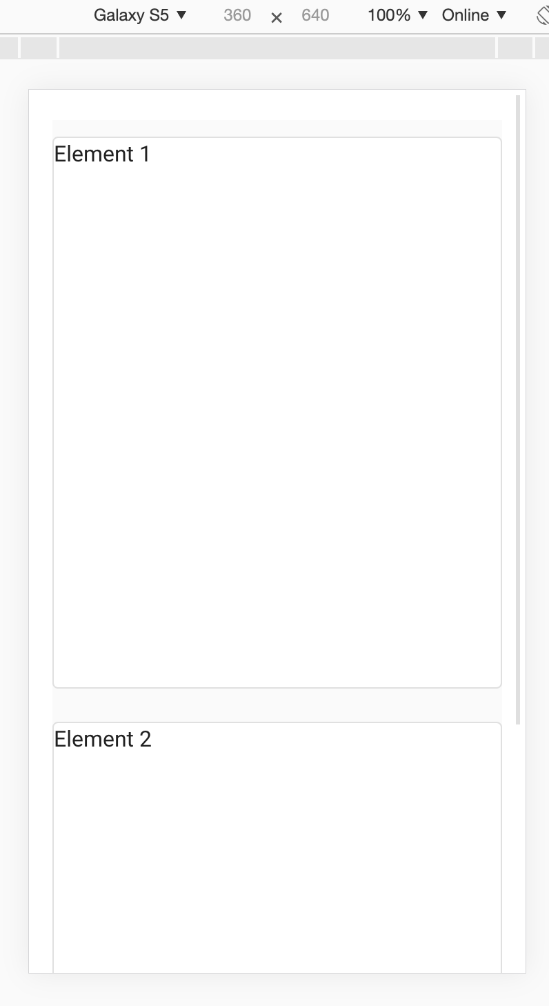
When making dashbords with Voilà you can change the layout depending on the users screen size. This is done with a grid system. For example on a laptop (breakpoint md) you could fit two elements next to each other while on a smartphone (defined with ‘cols’ as default) you would want one element to take up the full width:
v.Row(children=[
    v.Col(cols=12, md=6, children=[
        v.Card(outlined=True, style_='height: 400px', children=[f'Element {i}'])
    ]) for i in range (1,3)
])
Which displays on a laptop as:
On a phone as:
In the display section you will find CSS helper classes to do more customizations based on screen size.
Event modifiers
In Vue event modifiers can be used to change event behavior.
For example when you have two nested elements and want a different click handler for the inner and outer element, the
stop event modifier can be used by appending .stop to the event name:
icon = v.Icon(right=True, children=['mdi-account-lock'])
btn = v.Btn(color='primary', children=[
    'button',
    icon
])

icon.on_event('click.stop', lambda *args: print('icon clicked'))
btn.on_event('click', lambda *args: print('btn clicked'))

v.Container(children=[
    btn
])

# Note: the event handlers won't work in this page because there is no active kernel.
.sync
When you see .sync appended to an attribute in Vuetify syntax, it means the attribute has a two-way binding (like v-model). This is shorthand in Vue
that automatically listens to an event named update:<attributeNameInCamelCase>.
We can achieve the same manually in ipyvuetify by setting an event handler
<widget>.on_event('update:<attributeNameInCamelCase>', <function>)
Vuetify:
<v-navigation-drawer :mini-variant.sync="someProperty" ...
ipyvuetify:
drawer = v.NavigationDrawer(mini_variant=True, ...)

def update_mini(widget, event, data):
    drawer.mini_variant = data

drawer.on_event('update:miniVariant', update_mini)